The Role of Typography in Editorial Design: A Comprehensive Overview
Introduction
Typography is not merely a matter of picking pretty fonts; it’s about arranging text in a way that makes it easy to read and visually appealing. In editorial design, typography plays a critical role in creating an enjoyable reading experience.
Readability and Accessibility
First and foremost, choosing the right fonts, sizes, and spacing is essential for readability and accessibility. The goal is to make readers easily digest the information without straining their eyes.
Visual Hierarchy
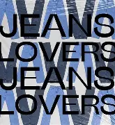
Visual hierarchy helps create a structure within the text. By varying the size and weight of headings and subheadings, designers guide readers through the content, making it easier for them to find important information quickly.
Emphasis
Designers often use bold or italic styles to highlight quotes or key points. This draws the reader’s attention to the most important messages and enhances their understanding of the content.
Setting the Mood
Different fonts can evoke different feelings. For instance, sans-serif fonts often suggest modernity and simplicity, while serif fonts can feel more traditional and elegant. This helps readers connect with the content on an emotional level.
Consistency
Using the same typography style across various publications builds a recognizable brand identity. Readers start to associate that style with the publisher, which can foster trust and recognition.
Adaptability
Whether in print or on digital screens, the text should remain legible and appealing. A well-designed layout with thoughtful typography makes the reading experience more enjoyable, inviting readers in and keeping them engaged.
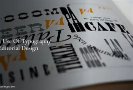
Typography in Graphic Design Portfolio Websites
In graphic design portfolio websites, especially those showcasing editorial projects, typography plays a critical role. It helps create layouts that catch the viewers’ attention and establish a consistent visual identity across different projects.

Fundamentals of Fonts
Typography is the art and science of arranging text to be both legible and appealing. The fundamental building blocks of typography are characters, and designers manipulate different parts of them to create different typefaces.
Choosing the Right Font
Different fonts are like different tones of voice. A silly font might be great for a clown, but not a lawyer. And a fancy font might be perfect for a wedding photographer, but not an eye doctor. So just like you want to speak in the right tone of voice, you want to pick a font that matches the energy of the project you’re working on.
History of Typography
The history of typography is rich and complex. One essential milestone was Nicholas Jensen’s invention of the first serif typeface in 1470, which revolutionized the way text was arranged.
Conclusion
Typography is a powerful tool in editorial design, enhancing readability, visual appeal, and brand identity. By mastering the fundamentals of fonts and understanding their emotional impact, designers can create captivating layouts that resonate with audiences.