The Evolution of Graphic Design in London’s Underground: A Journey Through Time

The Early Years: From Complicated to Simplified
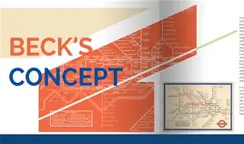
In the early days of London’s Underground, a map was created in 1908 to represent the system that resulted from the merger of eight independent railways. This map was geographically accurate but not very useful for commuters, as it included rivers, bodies of water, trees, and parks, making stations hard to distinguish. It was Harry Beck, a 29-year-old engineering draftsman, who had a key insight: people riding underground in trains don’t care about what’s happening above ground, they just want to get from station to station.

The Revolution: From Map to Diagram
Beck simplified the complicated mess of spaghetti lines and created a diagram that resembled circuitry. He arranged the lines in three directions (horizontal, vertical, or 45 degrees), equally spaced stations, and made every station color correspond to the line’s color. In 1933, the underground decided to give Beck’s map a try, and it quickly became a hit with commuters.
The Legacy: A Template for the Future
Beck’s design has become a template for metro maps around the world, including Tokyo, Paris, Berlin, Sao Paulo, Sydney, and many others. His innovative approach to visual communication revolutionized the way we think about transport systems and has left an indelible mark on modern graphic design.
Conclusion: The Art of Simplification
The history of graphic design in London’s underground is a testament to the power of simplification and the importance of understanding the needs of the user. Harry Beck’s map has become a timeless example of minimalist design that continues to inspire designers around the world.